-
2 Free Vintage Poinsettia Images
Christmas is coming, so it’s time for some free poinsettia images!
This week’s offerings are from a mid century Christmas card with… greetings. Just greetings! I’m sure it’s for Christmas, though. It doesn’t take much imagination to consider it a December birthday card, I guess, with the poinsettias and all.

Click the picture to open it at full size in a new tab! I love it. What a beautiful picture of a poinsettia! That little box can be repurposed, all you have to do is remove the “Greetings”…
Voila! Like so. Now, what will you put there? You should totally show me by commenting on this post. I love seeing what folks make!
The other poinsettia image is from the inside of the same card. Although the layout is pretty similar, it’s a lovely graphic and would look nice in a variety of projects. Pair with some ribbon or holly, perhaps?

Wanna know what’s extra special about this vintage poinsettia?
Glitter.
Along the inner lines of the leaves and “petals” (which are actually more leaves) are a glittery, metallic ink. It adds a little something extra—and, with a clipping mask and digital glitter, you could really make it pop.
See? I’m thinkin’! That’s a thing I sometimes do.
I hope you like these free poinsettia images, and that you’ll join me again soon for some more genuine vintage. I have a bunch more Christmas graphics to throw at you for this year! Then, after that, more scanning. I’m not kidding when I say I have a lot of material. 😉
Ta-ta for now!
xoxo,
Missie
P.S. Consider buying me a coffee or subscribing to my newsletter to help support the site. This is a passion project, and earnings from products, affiliates, etc. help me spend more time writing and editing.
-
Vintage Boldt Castle Postcard
Most people are preparing for Christmas while I’m here thinking about Boldt Castle in the Thousand Islands because of a vintage postcard. What a sad, beautiful place it is.
I found this image of Boldt Castle some time ago, in excellent shape and with a story to tell. It’s a tale of love, devotion, heartbreak, and over 70 years of neglect… with a happy ending for the landmark itself.
Back in 1900, old George Boldt—the guy that owned the Waldorf-Astoria in New York—held several parcels of land in the Thousand Islands, including Heart Island. He and his family spent many summers there near their farm on Wellesley Island, which itself was a massive operation. The old farm produced ridiculous amounts of food for Boldt’s hotels!
In all, the family held over 3,000 acres of land in the Thousand Islands region.
Love and Loss on Heart Island
Heart Island became the site of a monument of Boldt’s devotion to his wife Louise, the love of his life and mother to his children. Over 300 workers toiled for four years to build the beautiful, 6-storey, 120-room rhineland castle and crafted its exquisite gardens. George spared no expense. The castle had ample room for the entire family, state-of-the-art (for the time) amenities, breathtaking views… it would be a fitting gift to his beloved wife.
If only she would live to see it.
In January of 1904, Louise passed away very suddenly, leaving Boldt heartbroken. Construction stopped. George Boldt never set foot on Heart Island again.
Boldt Castle owes its current condition to the Thousand Islands Bridge Authority. They obtained the property in 1977 and set to work almost immediately, consequently saving the remaining buildings from over 70 years of neglect. Their work continues to this day.
The Postcard

I bought this vintage postcard at an auction between 2020 and 2022. It was with a bunch of other postcards of American locales, most of which I didn’t recognize. Finding this one was exciting! I visited Boldt Castle once as a child, on a family trip to the Thousand Islands. My memories of it are fuzzy, but what I do recall is that it is hauntingly beautiful.
I spent my childhood summers going on little trips around Ontario: Ottawa, Gananoque, Niagara Falls, Sault Ste. Marie, Midland, Sudbury, St. Jacobs, and other interesting tourist spots. Mom and I went to Gananoque with my great uncle, but I don’t recall why.
The back of the postcard credits the photograph to Harold F. Keeler in Alexandria Bay, New York.

-
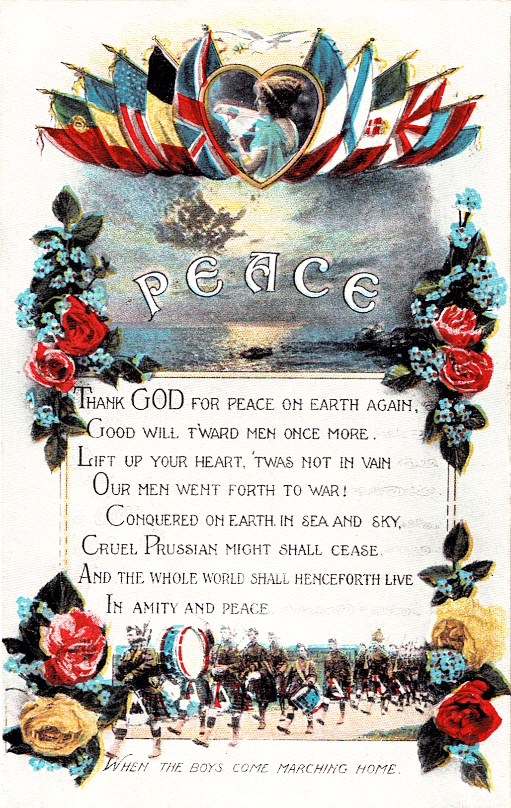
A Postcard for Peace, 1919

Peace. A post-WWI postcard. Thank GOD for peace on Earth again, Good will t'ward men once more. Lift up your heart, 'twas not in vain Our men went forth to war! Conquered on earth, in sea and sky, Cruel Prussian might shall cease. And the whole world shall henceforth live In amity and peace.
H.G. Wells was the source of the phrase “the war to end all wars”. This was the title of his book from 1914, The War That Will End War, a collection of articles he published in London newspapers. Wells had the idealistic belief that the end of the conflict would make it impossible to wage future wars.
Obviously this was not the case, as Wells himself acknowledged; those words took on a cynical, sneering quality through four years of WWI, and another six years of the Second World War.
I cannot imagine the horror of First World War survivors watching a second, more terrifying conflict emerge in 1939. Imagine celebrating the end of war and then, 21 years later, there it is again; and this time, when it’s over and the dust settles, a new word will be coined for an old horror.
Genocide.
I can’t grasp the mindset behind the desire to wipe out an entire group of people—and then working to go through with it. That scale of violence doesn’t make a lick of sense to me and it shouldn’t make sense to anyone else.
But that’s what we’re witnessing right now, in the year 2023: genocide. Thousands of people are dying in Gaza because of one leader’s lust for blood and land, and the world is just sitting by and watching it happen. The cowardice of our leaders is on full display, refusing to stand up for the downtrodden who have gone through seventy-five years of being abused, and maimed, and slaughtered, and kidnapped, and pushed from their homes to make room for settlers.
On November 11, 2023, at the 11th hour, it will have been 105 years since the end of the war to end wars.
If only.
-
2 Pretty Japanese Postcards
Today’s vintage graphics are a pair of pretty Japanese postcards.
I don’t know the dates, I can’t read the text, so we’ll just have to admire the artwork—and the artwork is quite lovely. Check them out with me below.

A river on one side, a wall of trees on the other, and a walking path in the middle: the picture of serenity. A relaxing stroll through nature where the details get harder and harder to discern as the scenery stretches out before you. Love that perspective, it’s awesome. Little blips of brown-orange here and there hint at fall being on its way. This would make a gorgeous art print.

A waterfall thunders over the rocks below before the river can continue on its journey. Another lovely picture!
If you happen to know more about the artist, or the image series, please speak up in the comments below. I’d love to be able to get my hands on more of their work.
Thanks for joining me, stop in again soon for some more vintage graphics.
-
5 Antique Thanksgiving Postcards
I missed Canadian Thanksgiving this year (it’s been a very busy time!) so I figured, well, better late than never—especially with all of the Thanksgiving postcards I have hanging around here!
My Gods. Turkeys all the way down except for one postcard. Just one.

A Tom shows off to some hens that really could not possibly manage to scrape up an ounce of care if their lives depended on it. What fascinates me the most about this piece is the snow-covered scenery: I rarely, if ever, see snow in Thanksgiving cards! I adore the little chickens. The one on the right that’s running off appears to be on a very important mission.
It was published, or at least copyrighted, in 1908 by M.W. Taggart in New York.

Now here’s a nice, simple sentiment:
Greeting and all Good Wishes for a Happy Thanksgiving Day.
The wishbone is a nice touch! All that ornamentation on the lettering is gorgeous, I cannot imagine how long it would have taken to prepare.
It also attempted a turkey. It was a very vague attempt, I’ll still give them credit for trying!

Ah, textured paper, my old nemesis. Despite that, it’s a sweet image of a child feeding a turkey. The turkey doesn’t appear too thrilled about anything (which may just be because he’s aware he’s in a Thanksgiving card), let alone that there’s a small child within pecking distance.
Turkey’s just looking for The Ladies.

May the Harvest Moon shine on [full?] crops of happiness this Thanksgiving Day for you. A Patty Thum postcard! Patty Thum was an American artist that was known for her landscape paintings. She was also an avid illustrator of children’s books and loved to paint roses. This lovely autumn scene would make a perfect print on its own—the typeface used here is very, very unusual.
It’s interesting, though none of the text is placed very well on this image.

Say, here’s your Thanksgiving! This cheeky little bugger is from 1907, by the Ullman Manufacturing Co., a company with a fairly long list of products. They printed postcards, lithographs, and greeting cards, among other commercial print pieces.
I’m fond of this particular postcard because of this kid.
I hope you all enjoyed this batch of Thanksgiving postcards, and I can’t wait to see you here again for another round of ephemera!
-
1920 Funeral Card From Gamebridge, Ontario
Elizabeth Jane Brock passed away in Gamebridge, Ontario, on Monday, May 3rd, 1920, as per her funeral card. Without this curious little piece, we may not know she existed.

Inside of 1920 funeral card—just click on it to open in a new tab. She was married to Adam Carson and was only 50 years old when she died. Her funeral left the family home at 2:15 pm on May 5th, 1920, and the church service started 15 minutes later.
I have never seen ‘intimation’ used in this way and had to look it up: it’s a subtle suggestion. A hint. If you were like me back then and couldn’t grasp a hint to save your life, you probably didn’t attend!
Since originally posting this piece, I stumbled upon the scan of the front, and decided it had to be in this post and not on its own. It’s as simple as the inside.

Very little needs to be said on a funeral card—a single glance tells you exactly what it’s all about.
If you prefer your ephemera clean and bright, I restored both sides of this funeral card for you!
Back then it was the norm for a person’s body to remain in the home until burial. Now, however, not really, though it depends on the culture. We in North America are separated from the realities of death and I sometimes wonder if that’s a bad thing—perhaps it’s why empathy is in short supply.
That, or I’m just feeling cynical today. Alas.
Funeral cards, memorial cards, mortuary cards, or remembrance cards are still made and distributed today. You won’t see them as often now as in the 19th and early 20th centuries, however. They’re a keepsake of the beloved dead, a small piece of history to tuck away for later.
Join me again soon for more ephemera and, perhaps, a little history lesson.
Cheers!

P.S. Did you enjoy today’s blog post? Consider buying me a coffee or subscribing to my newsletter!
-
4 Real Photo Postcards of Young Women
The past several weeks have been super busy with re-arranging the store (Treasures by the Locks in Fenelon Falls), preparing for an upcoming job interview, getting Treasures’ social media sorted out, and getting my shops properly set up. Unfortunately, that has meant neglecting the things I want to be doing—like blogging. Especially blogging.
This week’s offering will be a short one, alas, though I do have several things in the pipeline and Plans afoot. Plans is capitalized because it is an Important Word, you see.
Among my various postcards have been some lovely early 1910s RPPCs featuring young women. The subject matter varies little otherwise, and I just like these images. They’re simple and kind of relaxing. They may be good for making cut-outs, too.

Amag 6363B/6, by Albrecht & Meister AG. The postcard company that printed this image produced a lot of postcards featuring various actors and actresses, and started business in the 1860s. They were based in Berlin, Germany, with an extensive collection of offered postcards. I think my favourite detail in this piece is her outfit, the garment is very loose and flowing, not super-restrictive.
This company made several postcards of Mary Pickford that I would really like to get my hands on, hint, hint.

A cheeky lady on the beach, photographed by Alfred Noyer, whose work out of his Paris studio consisted of many beautiful women in varying states of dress. This real photo postcard is from the late 1910s. Noyer’s studio was in operation from the early 1910s to the 1940s, and the quality of his work is consistently very good. I would really like to have a swimsuit of the pictured style! The backdrop is definitely painted, this must have been a studio photograph.

Now isn’t this sweet? A hand-coloured portrait of a girl and her horse, also by Albrecht & Meister AG, numbered 63397/6. Horses were another common subject of Albrecht & Meister! The colourist paid close attention to the lighting here instead of applying a uniform colour to everything regardless of how bright it was supposed to be.
I wonder what secrets she’s telling her friend? Wouldn’t this be perfect for a horse-themed birthday invitation?

I admit to being extremely biased toward this postcard because I, too, love reading, though that’s not a very comfortable position for doing so. She may be writing in a journal, though, hence the file name. This is a Lithuanian postcard, I believe, and the translation (according to Google) would be “I congratulate you on the name day”.
Her outfit is adorable and I kind of want it.
Thank you for joining me this week. I hope you enjoyed this selection of real photo postcards of young women, and I hope you’ll stop by again soon.
Just so you know, I have updated my Ko-fi page with a new membership. Buy me a coffee and download all my printables for free (the digital files in the shop!) or donate monthly, starting at $1.00, to unlock the same.
Higher tiers get a little gift in the mail as a thank-you.
A Podia community is being developed that will allow me to offer things like courses. This sort of thing takes time, however, so all I can say is “watch this space” and hope. 😉
See you soon!
xoxo
Missie
-
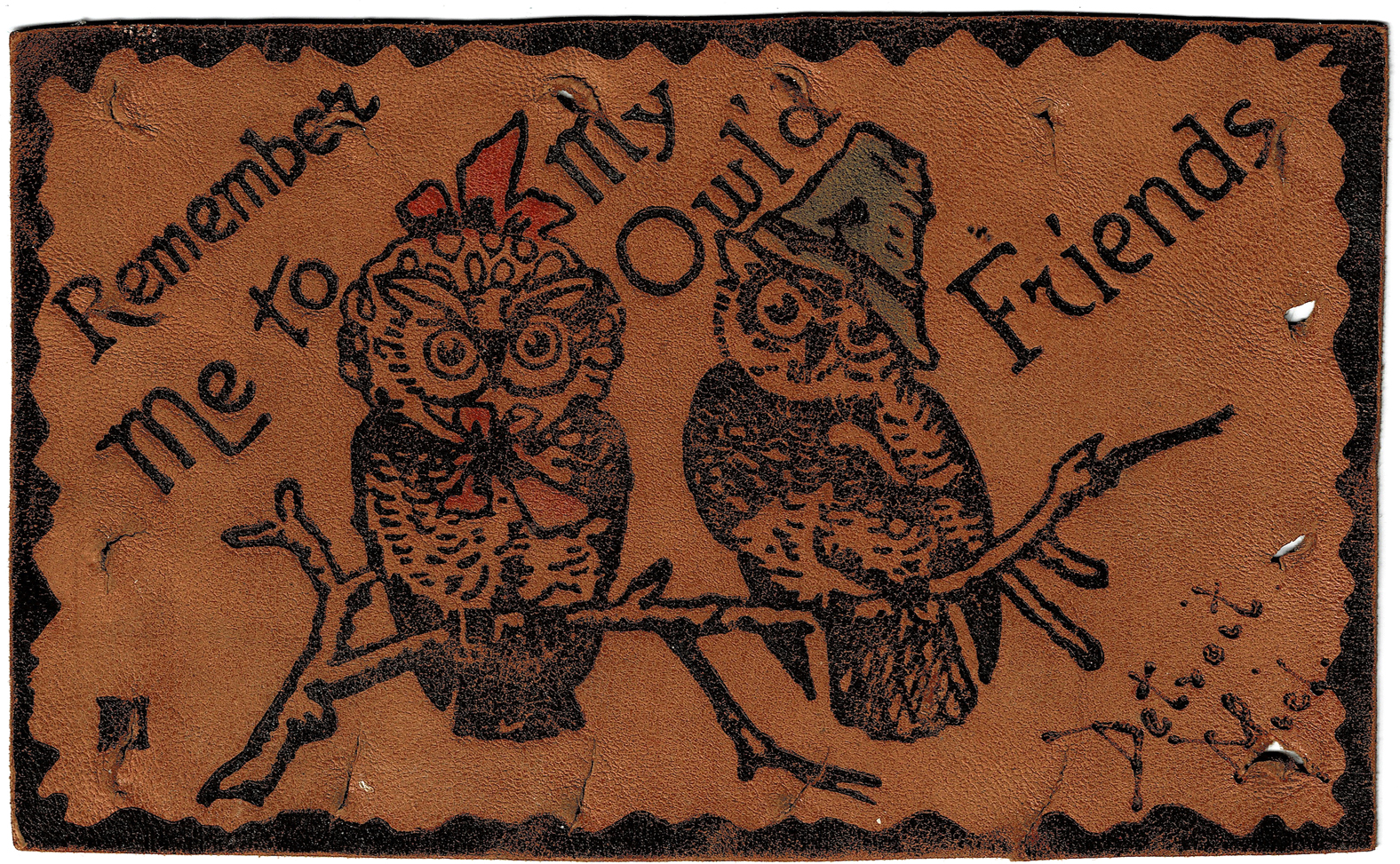
The Leather Postcard: A Concept As Ridiculous As It Was Impractical
During a very brief, very dark period in history (typed with tongue planted firmly in cheek, I assure you), postcard publishers decided that the best way to stand out among their competitors was to do something so different that it became impractical: they produced postcards made of leather.
Not stiff leather, which can be mailed with few issues, but soft and floppy deerskin.
This product of the early 1900s was made by burning images onto rectangular pieces of leather and then, maybe if they were feeling a little silly, adding some colour to the piece. The decorating method was called “pyrography” and involved heating up the tip of a sharp tool, like a poker, and using it to draw the desired image.

This pair of owls went to Detroit. Click to open the full image in a new tab and download it for your projects! Subject matter varied from punny jokes like the above, to raunchy bits, to scenery. There were leather postcards for every occasion, want, or need (depending on your definition of ‘need’).
Some even had holes along the edges to allow collectors to sew their findings together into a wall-hanging or pillow! Novelty shops that sold these postcards were encouraged to display such a decoration in order to draw in more sales. Can you imagine?

Note the holes and space to write an address—and only an address. This fad lasted less than ten years before the United States Postal Service banned them from being mailed out—the soft, thin cards were getting stuck in mail sorting machines, making life a lot harder for the postal workers. The era of the leather postcard was over!
Temporarily.
People still sent them in the mail in envelopes instead of by themselves, and the leather postcard faded away around 1915. Many, many years later (though I’m not certain exactly when), leather postcards started showing up in Old West souvenir shops and were once more able to be mailed. Between better, newer mail sorting equipment and stiff leather being used in postcards instead of soft leather, they simply stopped causing problems.
We aren’t completely safe from the leather postcard, I guess. If we’re lucky, maybe they’re mostly contained to the American West and will leave the rest of us alone.
Until next time!
If you enjoyed this post, please consider signing up for my mailing list in the blog sidebar. You’ll get a weekly digest of The Paper Girl posts and you’ll stroke my ego, which will encourage me to do more things!
-
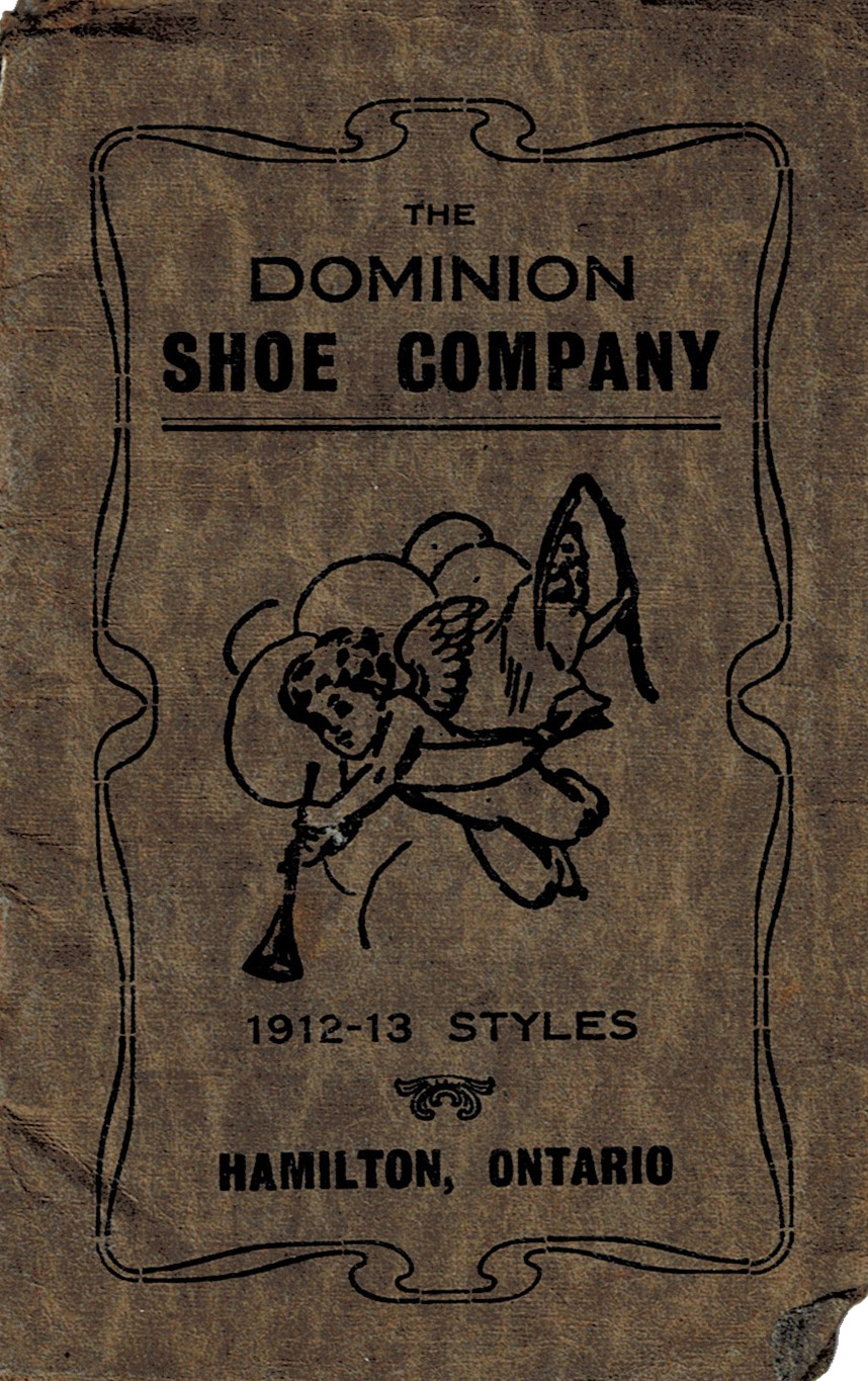
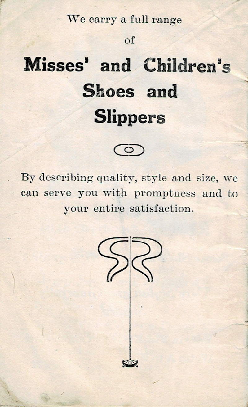
17 Pages of an Antique Shoe Catalogue, 1912
A really interesting little piece that’s in my collection is this Dominion Shoe Company Catalogue of 1912-1913 styles from Hamilton, Ontario. I haven’t been able to find any information on the company itself, but this booklet still gives a really interesting look at what was en vogue at the time.

Yes, the booklet is in terrible shape on the outside: the cover is torn and creased, yet it’s a fascinating thing. What does a cherub have to do with shoes? Absolutely nothing.

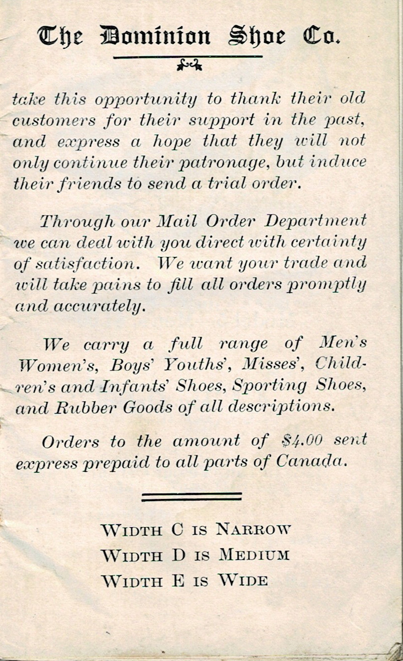
According to the first page, this catalogue is but a tiny sample of what The Dominion Shoe Co. carried at the time. The addition of rubber goods is fascinating—what rubber goods did they carry? I mean, going from shoes to rubber goods of all descriptions is a bit of a jump.

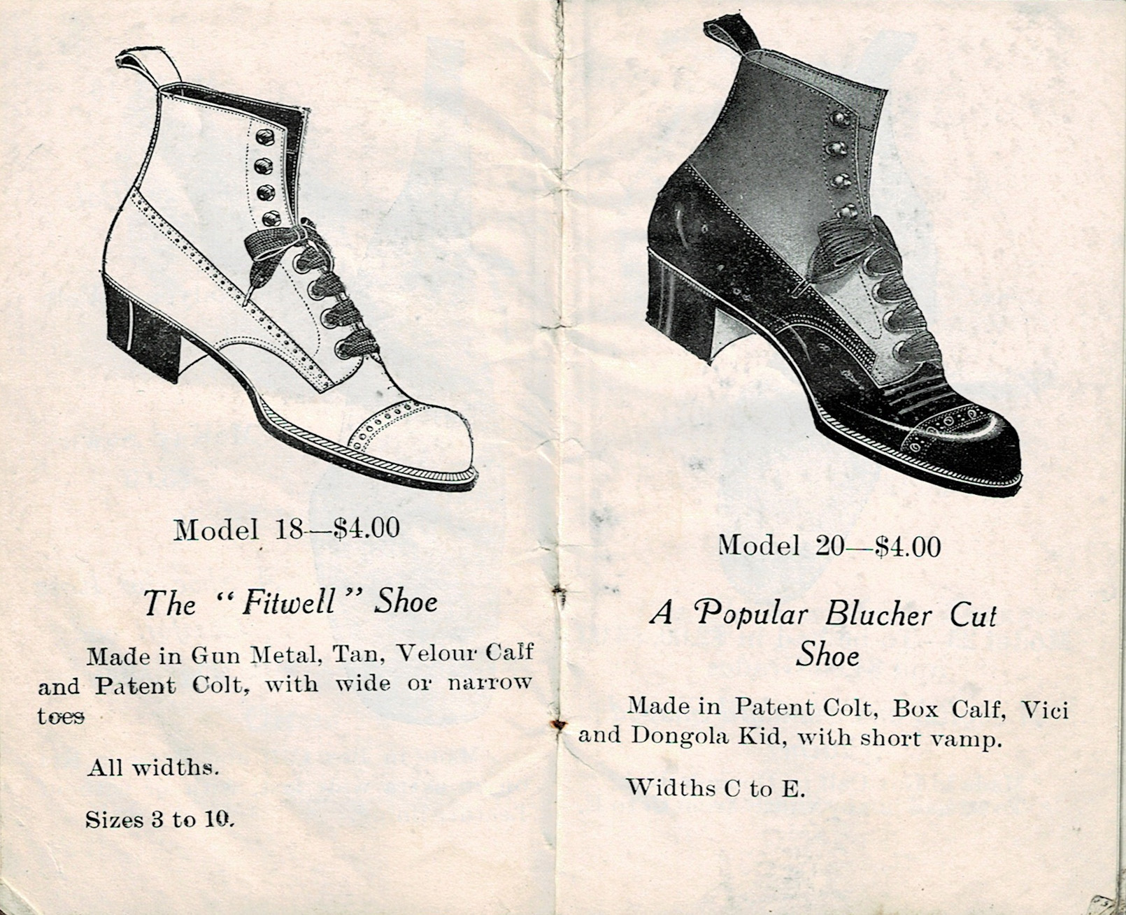
Each shoe is illustrated on these pages, with a title and description of materials. Even the available sizes and widths! Very classy shoes. In today’s currency they would cost approximately $126—though the prices would likely increase further than that because of the cost of materials and labour. They were made with real leather, after all.

These handsome shoes were also just $4.00 per pair, except for the McKay Sewn version of the Police Bal. None of those words are familiar to me.

I like both styles of shoe listed here. Ankle support! Classy appearance! Would look extra handsome with the right suit!

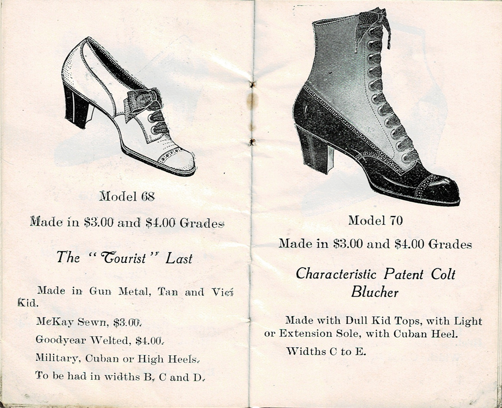
The standard-shaped Blucher listed here appears to be the everyman’s shoe, being available in multiple price grades (from a humble $2.00 up to $4.00) and in every width.

What exactly is “advanced and correct style”? Let me know when you figure that out!

Although Model 45 looks a bit like a clown shoe from this angle, I’m sure it was a truly elegant product in its time.

I really appreciate what looks like a bow on Model 60, in black-striped ribbon, no less!

Although I utterly hate heels I still find the ankle strap pumps to be utterly adorable. Maybe it’s the bow. It has to be the bow.

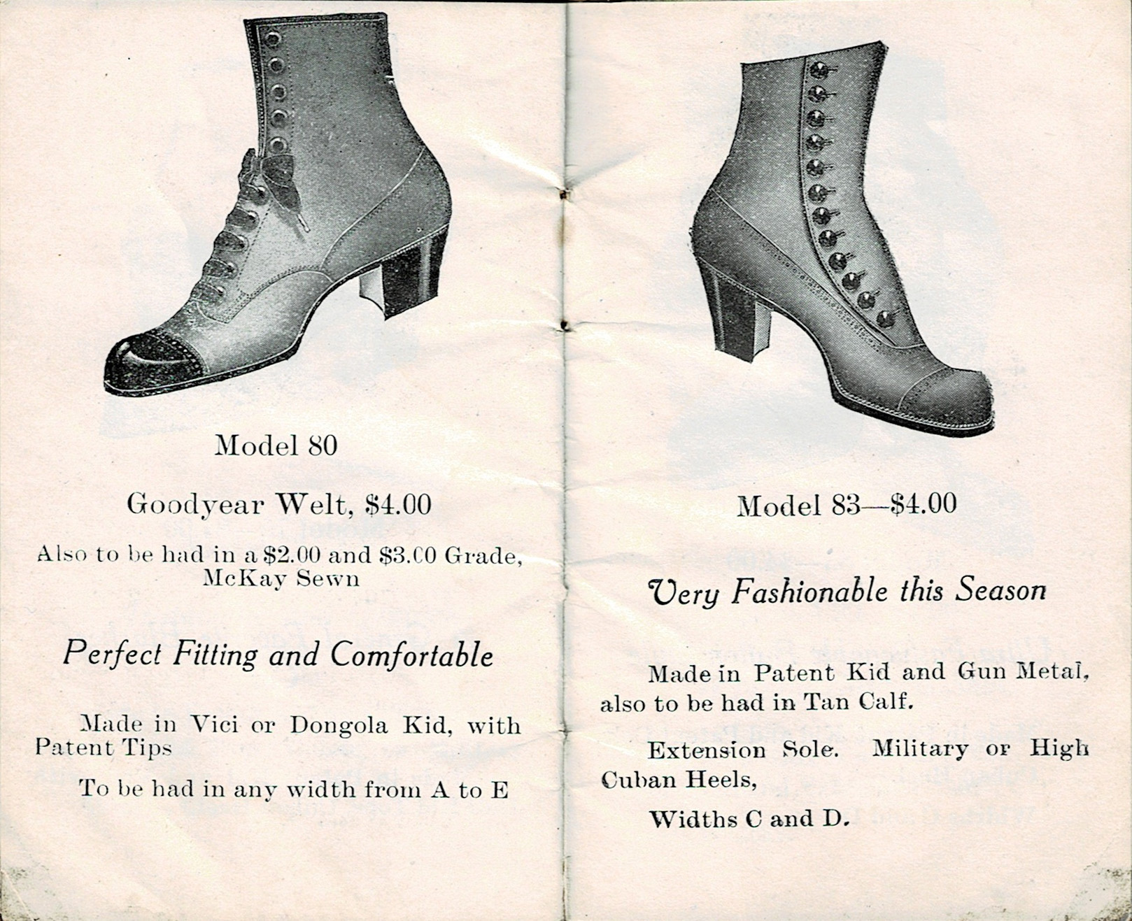
Ah, we’re starting to get into the boots. Dark bottom half, slightly lighter top half is a very neat look.
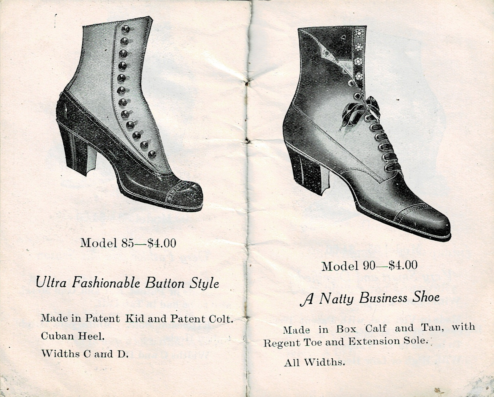
Aristocratic and Genuine Style, indeed. How about a fancy cane and hat to go with that footwear?
A note about Vici: it’s kid leather, chrome-tanned with an oil and soap finish. This type of kidskin was developed in the 1880s and featured in the likes of Vanity Fair, very fancy stuff. Kidskin itself is a very soft and thin leather that was mostly used for gloves. Sometimes lambskin or calfskin were used instead as they were similarly soft and thin.
The word ‘natty’ means neat, as in fashionable. This term was coined in the 18th century and would still have been in common use in the early 20th century. It’s definitely not slang that I hear very often, though a lot of that is from me being in northeastern Ontario and not, say, London, England.
I love how the descriptions repeat themselves, just with different wording, as if the writer was flipping through a thesaurus the entire time.

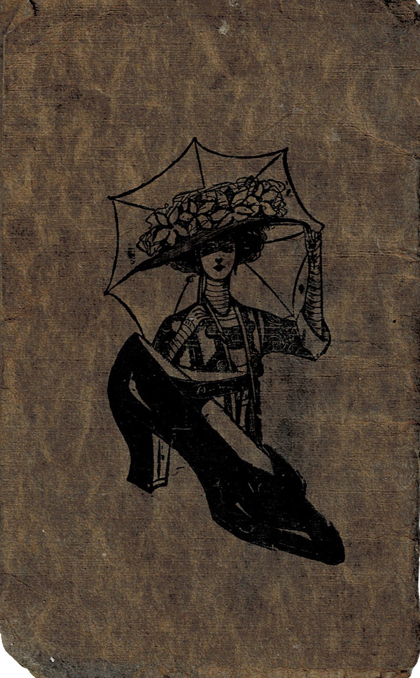
This is the very last page. A couple of interesting decorative elements here, as well as the hope that the reader will seek this company out for other products.

The back cover. I love this graphic. The lady with her parasol, looking rather stylish, and the shoe just… existing there, as they do.
What did you think of The Dominion Shoe Company’s selection? Did you have a favourite type of shoe?
I hope you’ll join me again soon for more vintage graphics, and remember to subscribe to my mailing list!
-
Cabinet Card Folder & Cover
I’m rather excited about the piece I have for you this week.
You’ll have to excuse my tardiness—I had a very sudden bug hit me on Thursday evening and I’ve been out of commission until today. It’s terrible, but it’s also the only time I’ve been sick in several years. I’ll take that over how sick I used to get every year when I was working with the public all the time. Getting that sick now would be far more concerning than it was back in ye olde days as I have no idea how well I’d bounce back!
At any rate.
Cabinet cards replaced the much smaller carte de visite, and in the process, they also managed to toss traditional photo albums by the wayside for a good thirty years or so until manufacturers were able to adapt.
Photography studios got very creative with how they presented these pictures to their clients, especially since the final product would be displayed in cabinets (as per the name) or elsewhere in the home, where they could be seen by anyone instead of tucked away in photo albums.

This folder came with one of the cabinet cards in my collection. It’s heavy cardstock with a slightly-embossed design on the front, and would open up to reveal the cabinet card tucked inside. This is just one example of many that are out there, but this one is mine.
Photographers would decorate their work with their name in fancy script on the picture’s frame and/or holder. You would also find the studio’s full logo in all its stylized glory plastered on the back of some cabinet cards, depending on the decade, or decorating the folder somewhere. Embossing was especially beloved.
So much love and skill went into the creation of each cabinet card and its associated media. Each aspect is a piece of art on its own that’s worthy of study and interest. That’s what I love the most. It also makes figuring out eras a lot easier when there are certain features, like use of heavy cardstock instead of light cardstock, that were all the rage in each decade.

Here is the inside cover of a cabinet card holder. It had scalloped edges—popular in the 1890s—with an embossed design on one panel and the photographer’s information tucked into a corner (C.A. Lee of Listowel, Canada, took the photo that was contained in this folder). A previous owner wrote the information pertaining to the cabinet card: Mary Isobel Jickling, Dec. 23, 1915. She passed away in 2013.
I recommend using the above image as a background for a larger piece. There’s so much texture here! It’s worn with age, but not to the point where it can’t be given new life in an artistic endeavour, and it’s on a canvas-style cardstock. Very cool.
That’s all for today. I am working on a fresh batch of vintage graphics for you all to browse, so stay tuned and see you soon.

The Paper Girl
Antique & Vintage Ephemera Since 2019