-
Forget-Me-Not With These 4 Postcards

Forget-me-not flowers are pretty little plants that you’ll find growing in spring and summer. They are hardy little devils whose clusters of blue blooms have been symbols of devotion for a long time. You may even see it used in funerary art to remember deceased loved ones—and in the cases of postcards like these, to remind the receiver not to forget them.

The forget-me-not comes in pink and white varieties, too, and is considered an invasive species in some American states. Yeah. They are a self-seeding plant that is so good at spreading itself that they’ll just do whatever the hell they want if left to their own devices. Since they love wet soil, they’ll just kind of meander down into wetlands because sweet, sweet water.
Deadhead generously.

When we look at the meaning behind forget-me-nots in the Victorian era, we find that they—along with a lot of flower language—are associated with love. The memory of true love, devotion, a request to not forget the person sending the message. Adding more flowers creates more complicated messaging, or just adds to what’s been said.
Violets, as in the first postcard, are symbolic of watchfulness, modesty, and faithfulness. Perhaps this card was asking the recipient not to forget the sender and to remain faithful to them! There’s also some lesbian symbolism with violets and violas, with these flowers representing women in same-sex relationships as early as Sappho’s time. A flight of fancy? Maybe, if one forgets that same-sex relationships have been a thing for millennia.
Daisies are a message of innocence or loyal love. They also can mean “I’ll never tell”, something that aspiring authors may want to tuck away in their cap for later use.

Do my eyes deceive me? Am I seeing geraniums in a couple of these? If I am, they have an interesting meaning, too! Geraniums stand for folly and stupidity. Is it a folly to remember someone? Am I reading too much into these gorgeous vintage postcards?
Oh, probably, but it’s still fun to try figuring them out.
I hope you enjoyed these old postcards. Did you use them to make something? Share the links to your creations in the comments below!
-
What Happened to Beaucraft Greeting Cards, Ltd.?

Once upon a time, Toronto was home to Beaucraft Greeting Cards, Ltd., which produced a wide range of greetings and gift supplies. Their Beaucraft Expressions line was manufactured in Canada.
And did you know that this company was connected to the McMichael Art Gallery?
Don McMichael, Beaucraft’s founder and mastermind, was the brother of the McMichael Canadian Art Collection. He served Canada as a member of the RCAF during WWII, and upon returning home Don did what many former soldiers did and entered into business for himself and his family: he started making greeting cards.
Back then, door-to-door sales were common and even expected. People could show up and try to sell you just about anything—from vacuums to cookies and more! Now, notsomuch. We’re warned not to open our doors to salespeople because, most of the time, it’s a scam. Or it’s Rogers and Bell trying to sell you internet you can’t get. Same thing.
Mr. McMichael’s business bloomed. As Beaucraft grew, it went from the back of a wagon to serving Toronto direct retail locations, then expanded far beyond that. By the time the company acquired “Kards by Kay” in 1984, they had spread through the Golden Horseshoe and across Canada.
And then, suddenly, they disappeared.
Donald Norman McMichael passed away on January 13, 2009. References to Beaucraft as an employer on LinkedIn have positions ending in 2011 and 2012, and the last successful snapshot of beaucraft.com on the Wayback Machine is from February 2011. After that, nothing, except for a note that the website was for sale for a while.
Did somebody buy them out? I thought that perhaps Carleton Cards had, but wasn’t able to find any data to support that guess.
On the old Beaucraft website, it states that the company manufactured and distributed cards under license with some of the biggest names in the industry. They were building their own worldwide network of freelancers and creatives to better position themselves in their industry, and made claims of being “on the cutting edge of market trends.”
But, like many of Toronto’s manufacturers, Beaucraft vanished into the mists of time.
If you have further information on the fate of Beaucraft Greeting Cards, Ltd., comment below or send me a message. I’ll update this post when I learn more. In the meantime, please enjoy the two label graphics from one of Beaucraft’s cards. Just click on each one to open the file at full size.
-
4 Vintage Spring Images
Good morning!
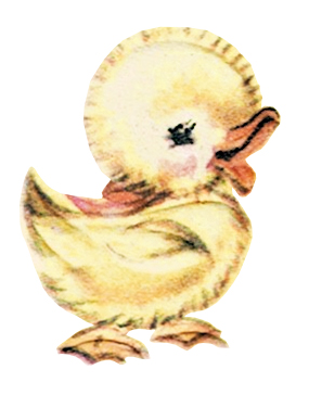
Today we’re getting into the spirit of spring (finally) with some floral arrangements and a cute duck. Yes, a duck. Look at this little thing.

It’s so happy! Believe it or not, this critter came from a midcentury bridal shower card. Graphics from wedding-related things are wild, y’all. They range from birds to umbrellas (ha ha, literal shower, oh ho ho get it?) and stuff that’s even more unrelated to… getting gifts for one’s wedding.
Anyway, I promised MORE SPRING!

It’s a fabric or paper fan with flowers all over it. Another little something from a midcentury greeting card. Greeting cards are difficult to scan because so many of them have weirdly textured paper, so I’m always ecstatic to find something that isn’t like that.

These would look nice layered with other flowers. So would this set below:

The perfect type of flower for those of us without a green thumb: they don’t wilt or wither, they don’t require food or water, and if you don’t like the colour, it’s easy to change it!
Thanks for joining me today. If you’d like to add more flowers to your vintage image collection, check out the previous post I made on the subject: Flowers, Flowers, Everywhere: 11 Vintage Flower Images
-
2 Vintage Wildlife Postcards
Today I have two lovely old wildlife postcards to share with you. They entered my collection before the pandemic started, and I was a little uncertain about how to present them because I don’t have many in this category.
So I just thought, oh, what the heck. Let’s just toss these in here as they are.

Dawn in the Forest is a beautiful woodland scene of deer by a river. This postcard would have been released in the early 1900s to 1910s, and was one of a series. What a peaceful image. It is numbered 5621. The title and numbers may be cropped off for a project, if desired, or carefully removed with the healing brush.

From a painting by Moritz Muller the younger, likely, the original art piece was from the early 1900s. He and his father both enjoyed painting hunting scenes. This is a mostly-peaceful picture, at least, and very nice to look at.
I hope you enjoyed today’s selection!
Have you made anything lately? Tell me about it!
-
Hands Across the Sea Antique Postcard
Here we have one of my absolute favourites.

At the time when postcards were at their height, most overseas mail was coming in by ship. Vessels like RMS Titanic carried mail from England to North America and vice-versa, making it possible for people to keep in touch with relatives far away during a time before telephones and internet. Of course, if the vessel containing your postcard went down… you get the idea.
Give a toast to the Royal Mail ships of old and the planes of today! And, perhaps, consider getting into the habit of sending postcards to your loved ones, because it’s still a joy to get something in the mail that isn’t a bill.
-
A Lovely Coastal Scene Postcard
Good day, everyone. I come to you bearing a very pretty postcard that I think you’ll like.

This is an antique from my collection, of course, and completely unrelated to the Camel & Rider Real Photo Postcard from several weeks back. There are lots of neat little details: the ships and boats sailing along what’s likely the Nile River, the camels and riders greeting the two people walking along the shore, a little village nearby. Two little villages, perhaps.
What I really love about this postcard is how calm and relaxing it is. Just another day on the Nile Delta. Layers of plants and trees and that lovely sunset. Just beautiful.
I cannot make out the signature of the artist, so if you’re reading this and are familiar with the original piece, let’s chat! I’d love to know more.
Enjoy this week’s image, I’ll be back next week with some more interesting little pieces.
-
5 Free Vintage Envelopes
Old envelopes make for great digital vintage ephemera, especially if they’ve been used; there are stamps to cut out, fun borders, all sorts of fancy writing—lots of creative opportunities! I especially love old British air mail envelopes. Anyway, check out this week’s batch of free vintage images.

Although these two are going to the same person, their details differ enough to justify posting both. These are the envelopes that went with the letters from Scotland that I wrote about a while back—remember Olive and her dislike of The Beatles? They were mailed in 1965 via air mail, with a slight disagreement on the postage amounts.
What I love most about air mail envelopes is the red and blue (or black, occasionally) border. I tend to associate it with travel. So many people use them for vacation-related printables, and it’s easy to see why—air mail is bold!

In 1993, Father Arthur Smith mailed a letter from Antofagasta, Chile, to a Mrs. Helen Smith in Toronto. His sister, perhaps? We have a nice selection of stamps here, and what’s really cool is the address written on the typewriter. I grew up with electric typewriters, but was young enough that I don’t remember using them on a regular basis. I did use a dot matrix printer. Remember those?

The back of the air mail envelope.

Here’s the back of a plain envelope that y’all can use, too. A little wear, some scuffing, more interest.
I hope you enjoyed this week’s selection. See you next time with some more free vintage images for your collections.
-
Birch & Calla Lily Easter Card

One of my favourite postcards is from the early 1910s. The background looks like it’s patterned off the birch trees of my hometown, and calla lilies are laid over it as if they belong there. It says, “Wishing you a happy Easter”. Simple. Beautiful.
It’s from the first lot of postcards I ever purchased.
I even removed the message so that it could be turned into a card for… pretty much anything. Sure, calla lilies do have a special place in Easter card lore, but there’s no reason that this piece can’t have a new life as… perhaps a birthday message?

What do you think?
-
15 Religious Easter Images
Before we get too deep down the rabbit hole (in which there are no rabbits), I’d like you to take a close look at the below batch of Easter graphics and tell me what you notice.
What shows up in 8/9 of them?

If you said “white lilies”, you’re right!
Calla Lilies are a versatile flower that are often seen alongside the Virgin Mary in illustrations depicting her. They’re associated with the concepts of purity and rebirth, and since they tend to bloom around Easter-time, they’re often tied to Jesus’ resurrection.

Resurrection! Rebirth! Same thing.

That other white lily, the Easter Lily, was predominantly produced in Japan prior to the 1800s. These days, notsomuch: 95% of potted Easter lilies come from a small number of growers between California and Oregon. Their symbolism is comparable to the calla lily, however, as they’re associated with purity and rebirth.

Come get yer purity and rebirth right here!

You’ll see both brands of lily displayed prominently on religious Easter cards, along with bright whites and candles. Silver foil and crosses sometimes appear on these cards alongside Jesus and the occasional Bible verse. Maybe it’s specifically the lots that I found. Either way, the old postcards I have are not as overt in their religious references.

Another thing, naturally: crosses. You’ll see a lot of those. Crosses and silver.

A little Bible verse for good measure.

This card adds a little bit of silver, too, that’s just subtle enough one could almost miss it.

Lilies, candles, some more silver, a pretty little card in the shape of a church window.

This Greek Orthodox postcard doesn’t scream ‘Easter’ to me, but if you can read it, it might to you. I admire this one because it feels like a mixed-media piece, with its hand-painted elements that are light on detail combined with darker components that make me think of stamps.
And now, the Jesusening.

Any time Jesus shows up in a card about the holiday for His resurrection, take exactly three shots. One for each day. Also, don’t do anything I tell you to do in this article, you might die. Note the lilies here!

This is the “what the heck, man, you drank the last Pepsi and didn’t tell anybody? That’s so not cool of you” Jesus.

I like this card for the imagery of Christ holding a lamb, and also for how huge He looks compared to those kids, even if He is standing on something.

Now, now, Jeremy, pipe down, we haven’t made it to that hymn yet. Charlotte, I swear to Dad if you don’t stop picking your nose your finger’s going to get stuck—

Jesus appears about the same in every depiction on Easter cards: peaceful, robed, and very, um, pale. In many cases, He looks like He’s about to give Little Timmy a very gentle reminder that we don’t bite our classmates. Sometimes, like in the first image, He appears to be saying “what the shit?”
We don’t know, either, Jesus. We ask that question a lot ourselves.
Join me next time for another round of vintage images, and be sure to subscribe to my mailing list so you never fall behind!
-
The Latest News From The Paper Girl
As I sit here catching up on whatever the heck I’ve been doing, I figure now is a great time to provide some updates on what’s what here in The Paper Girl land.
Places to Find Me
You can now find me on Etsy and Ko-fi! Ko-fi is the platform I’m using for my writing. I have been using Ko-fi for years as a tip jar and participating in its growth, so I encourage creators and supporters alike to check it out. It has a lot of worthwhile tools.
Beyond that, I’m also occasionally posting on Instagram. My Twitter is too weird, you’ll just have to hunt that down yourself.
Print on Demand Products
Coming SoonOccasional print-on-demand items are showing up in my Etsy shop and will carry over once I get WooCommerce running. I don’t know how deep I’m going to dive into this, mind you, so don’t expect too much beyond the occasional witty postcard.
The Paper Girl Graphics Queue is Growing
This week has been spent editing more files between uploads to Etsy and Ko-fi, so more posts will be joining the queue. I have quirky cyanotypes, early 1900s Easter postcards, some Americana for our friends in the USA, Elvis, and more flowers than you can shake a stick at. I need to hit the scanner again soon, as there are bibles and children’s books in need of processing.
By the time I get through what I have waiting in the wings, I imagine we’ll hit the 1,000 image mark before next year.
I’ll soon be able to get into the Canadian postcards, too, and some proper history hunting. I wonder if I’ll be able to visit any of the places represented in my collection? That would be something.
Anyway, it’s going to be an interesting summer. Here’s to all the fun stuff we’re going to discover together. Is there anything you hope to see here? Let me know in the comments.
Cheers,
Melissa

The Paper Girl
Antique & Vintage Ephemera Since 2019