-
Oregon State Capital Postcard
Good morning, lovelies! A quick one today.

Say ‘hello’ to the state Capitol building in Salem, Oregon, likely from sometime in the 1940s.
The Capitol has had a bit of a wild ride: it’s moved from Oregon City, then to Salem, off to Corvallis, and back to Salem again. The most recent iteration was finished in 1938 after its predecessor burned to the ground on April 25, 1935.
It wasn’t the first time the Salem Capitol building had gone up in flames. When Congress finally decided that yes, actually, the Salem was definitely the capital city, the first building mysteriously burned and had to be replaced.
That second building lasted nearly 60 years, much better than the 11 days of the previous attempt!
Do you like what I do here? Consider becoming a supporter so I can do more of it.
-
Another 18 Pieces of Postcard Ephemera
This is likely the last batch of postcard ephemera that you’re going to see for a while.
Nowadays, I don’t scan the backs of postcards unless they’re particularly interesting or I’m planning on selling the card on its own. I have too much material for that, and too many stories to tell.
Most of these are from the early 1900s and were sent all over Ontario. I have some pieces that went to Hamilton, some to Toronto, and even a German piece or two. Note how different the handwriting is across each card. I can’t even read some of these, and I was raised with cursive writing.

I think this is one of the cards that was written in German. Look at how neat their penmanship was! I am kind of in love with this style of writing. It’s so pretty, so elegant! … To my eyes, anyway.

A letter to a sister sent in 1910 as an apology for not accepting an invitation, likely to Christmas festivities. The other person in the household isn’t well! I think the South Bay Post Office was located in Prince Edward County.

How quickly did these postcards arrive in the mail, anyway? Bob mailed this one out and stated that he’d write again the next week! 244 Markham Street is an old rowhouse in Toronto and shares the street with a boatload of other century townhomes. The location is worth a look on Google Maps, where you can see how renovations have changed the look of the street over the decades.

Alice wrote to her cousin Katie in 1908 to say she received her card and was happy to hear from her. She asked about “little Sylvia” and mentioned that all was well and the fruit trees were in bloom. It looks like Alice lived somewhere in Tennessee.
Katie Neuman’s home in Hamilton still exists, a humble little duplex with a small front yard.

In this postcard from 1914, the author talks about how surprised they were to hear from Grant and mentions having been “dogged” by him at what I think is the city show and at the Picton Fair. There’s heavy guilt-tripping all through this letter! Oh dear. The author was not happy with Grant and felt like they were being avoided!
It sounds a bit like the postal service may have lost some of their correspondence along the way. Whoops.
This person had so much to say that they wrote at every angle they could possibly find in order to use as much space as possible!

The writer here must be young, as they mention “getting along nicely in school” and their writing is kind of messy. Something is said about Christmas, but that’s about all I can decipher. I’m not sure what the 2000 stamp is about! Maybe this never made it to its destination?

Oh, what a sweet note.
Dear Ross,
I hope Santa will be good and fill your stocking and bring you everything you want don’t eat too much Merry Xmas Aunt Jennie
Arthur, Ontario, is a small-ish town located west of Orangeville, Ontario.

Here we go, I don’t remember what this is! I think it’s the back of an envelope and not a full postcard. The intact postal info is really cool!
Sent to Harrisville, New York, in 1925. It just squeaked by to wish the recipients all the best for 1926! The Merry Christmas stamp is interesting, isn’t it?

Aunt Jane wishing the Clark family a Merry Christmas and Happy New Year. I think that’s a C, anyway! This is a very simple postcard design, I like that.

Corbyville, Ontario is located near Belleville, and a distillery operated there from 1859 to 1989. Another distillery operates in the area now. Olive here has an interesting style of writing, though it may be more due to what she was using to scribble her note than anything else.
Dear Sister—
Why weren’t you out to Rally last night? Father will be out after you sometime on Wednesday. Well I must ring off as I have got to get at washing. Will tell you the rest later. Yours truly, Olive.
Why does every Olive we meet in letters sound kind of like a jerk!?

I do not recognize this writing—is it a form of shorthand?

This postcard definitely uses some short forms for things. Look at the loops! I may not be able to read more than a word of this, but that doesn’t mean it isn’t elegant as heck.

Code? Shorthand? Another language? If you know, tell me!

Allensville is way up north of Bracebridge, near Huntsville. The Muskokas have been very touristy for over a century.
John, the writer, spends this letter informing Mrs. Lawrence that he made it to Brandon and was waiting for a train.

This postcard reads:
Dear Sis
Rec’d your p.c.
Alright it makes me long to come over. Joe wants to know if you remember walking over these stepping stones.
1912722 Queen St. West is currently part of Terroni, a Toronto trattoria.

J. Beagles & Co., Ltd., was a British postcard printing company that existed from 1881 to 1939. They were best known for producing postcards depicting action scenes from plays, portraits of royals, or portraits of celebrities. This card was mailed in 1908!

Tune in next week for another batch of vintage images, and don’t forget to subscribe to receive the weekly digest! You can find the subscription form in the sidebar.
-
Mutual Life Assurance Co. of Canada Ephemera
Today we have a handful of pieces of ephemera from 1926-1934.
When Mr. Wright received his premium receipt in 1926, The Mutual Life Assurance Co. of Canada had been in operation for 56 years—30 of them as The Ontario Mutual Life Assurance Company. During this time period, they moved between several head offices within Waterloo, Ontario.
If you aren’t familiar with The Mutual Life Assurance Company, then you might be familiar with the Mutual Group (1988), Clarica (1999), or Sun Life (2002). The building they moved into in 1912/1913 is still standing and considered to be a significant historic site!

An official premium receipt from 1934. Note the really cool border and fancy text logo.

A threatening-looking Notice to Policyholders, which is just a statement to say that the policy-holder has to pay their bill on time.

This is a dividend receipt from 1926. The general manager at the time was a W.H. Somerville.
Gilbert J. Wright’s premium receipt. Gilbert lived in Bonarlaw, north of Belleville, which was a railway community for many years. The town had several names during its time, from Big Springs to Bell View. It gained the name Bonarlaw after a successful petition to change it to honour the Canadian-born British prime minister in 1921/1922—the only British PM born outside the isles, by the way.
The Bonarlaw railway station was quite busy, serving Canadian Pacific Havelock and Canadian National Maynooth lines, with daily trips into and out of Toronto. Both railways are now recreational trails that pass through the area: the Hastings Heritage Trail and the Trans-Canada Trail.

Another dividend notice, this time from 1934—which would be $580.95 today.
And here’s another policyholder notice.
The Mutual Life Assurance Company and Sun Life were both founded in Canada, with Sun Life starting out in Montreal, Quebec in 1865.
I’ll be back soon with another batch of vintage ephemera for you, so stay tuned!
-
8 Postcards for Family
Today I have some postcards that are hyper-specific in their purpose.
I occasionally run across pieces that are addressed to specific relatives—’to my dear’ aunt, uncle, cousin, mother, etc.—and dated about 1900-1920. That doesn’t say much, I know, since much of my collection is from that period, but they’re still interesting postcards. Most are made up of bunches of florals, often including forget-me-nots, and decorated with gold. Not like, real gold or anything.
Let’s go through some of these cards in my collection, maybe you can use them for your own projects!

A young woman sits at her writing table to pen a nice (we hope) letter to her brother. I like the way this postcard combines photography with illustration, and I can’t help feeling like “To My Dear Brother” is kind of sarcastic.

The second postcard is very fancy. Flowers and a little parchment that says, “To my dear Brother, in simple words my fondest greeting told, All blessings come to you that life can hold.” What a sweet sentiment! Using reds as shading is a very interesting choice.

To Dear Mother, a dove on bright green with a bundle of red blooms. Daisies, maybe? A pretty, and simple, arrangement. I adore the different shades of green being used here. If nothing else gets mother’s attention, this postcard certainly will based on its colours alone.

I like the combination of greenery and gold, with a little bit of Lily of the Valley. I adore those flowers. They’re so tiny and cute, but I don’t get to see them much anymore. A great way to keep in touch with a beloved aunt!

This time, we have flowers inside the word ‘cousin’, which is really cool. The date on the postcard is 1909, and most of the pieces in this style are around that time period. “To my dear [relative]” seems to have been a pretty big thing at one time.

I love the big rose blooms here. Instead of containing the flowers of ‘uncle’ within the confines of the letters, they make up the shapes complete with imperfections caused by the petals being mushed together. Cool, eh?

Forget-me-nots show up a lot in postcards, and for good reason. They’re a flower of memory and remembrance, a subtle reminder (or request) not to forget the person sending the note. They’re also very pretty, and come in a wider range of colours than what you often see on cards.

Another to my dear cousin, and this one with forget-me-nots. I told you that was a common flower in postcards! I’m a big fan of the delicate blooms here, and without much of a background it’s easier to read the text.
Do you have any similar postcards in your collections? I’d love to see them.
Anyway, I will be back next week with another batch of vintage images for you, so tune in then to see what’s up! You can also subscribe to my mailing list from the form in the sidebar and never miss a single post.
-
18 Pieces of Postcard Ephemera
I think some of the most fascinating aspects of collecting old postcards are the messages that can be found written on them. Each and every one tells a story of some kind (if you can decipher them) and represents a little piece of someone’s life and history.

Dear Helen,
Suppose you are back in school after the holidays. I have a very nice school.
L. Robbins, 1910 postcard.
Eileen wrote this postcard in September of 1908. Her writing is difficult to read, but she mentions feeling better and is very specific about wanting a nice little something. I think Carrie was in Ottawa. 377 Sparks Street no longer exists.

Someone with the last name of Robitaille wrote to wish a miss A Charbonneau best wishes for 1909. Much like the previous address, 702 Sherbrooke W either doesn’t exist or is no longer a home.

Irene in Dunbar writes:
Dear Jack & Carrie,
Just a card to tell yous we are all well & hope [you’re] all the same. I will put this card in [Mama’s] letter. Jack don’t you never intend to write! You told me to send you a lot of letters & I write about every time anyone writes and you don’t.
Love from Irene
Oh, gosh, Irene meant business.

Dear Friend:
Well, I am home once more until Wed […] when I leave for Montreal. How do you feel after your […] Thursday night, and what about your pleasant dream that you said you would [tell] me of. I never dream any more now, or I have none to tell you. I […] liked to have stayed another day but I was not sure if I had […] at once or not. Hope to hear from you.
It appears that 263 Florence St. doesn’t exist anymore, either!

Every postcard uses a different style of cursive writing and possesses different messages, if they say anything at all. It’s really cool to read what people were worried about at the time—and what sort of dramatics people were getting into with one another.

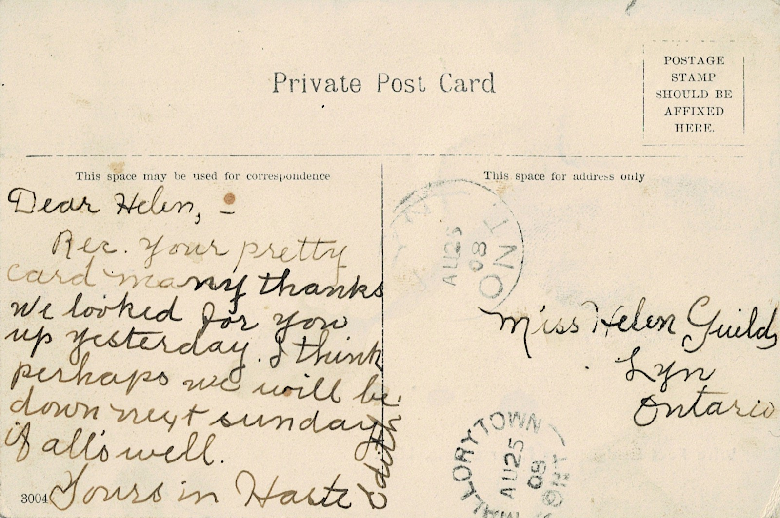
Dear Helen,
Rec. your pretty card many thanks. We looked for you up yesterday. I think perhaps we will be down next Sunday if all’s well.
Yours in haste,
Edith, 1908
Lyn, Ontario is part of Elizabethtown-Kitley township and is a very tiny village west of Brockville.

Dear Helen,
How are you? I would like to see Bill. Nic will be there at Thanksgiving. Jon[?] will be down then. I had Mrs. Neilson for a teacher a week ago. She is a lovely teacher. Write soon.
From, Bub as you call it
1911

From what I can gather here, the writer was telling Mrs. Davis not to look for them on Sunday and “not until you see us or hear from us later”. They don’t like keeping their kids out of Sunday School. It’s not clear why they’re not going to be around, or what the issue is. This postcard was mailed in 1912!

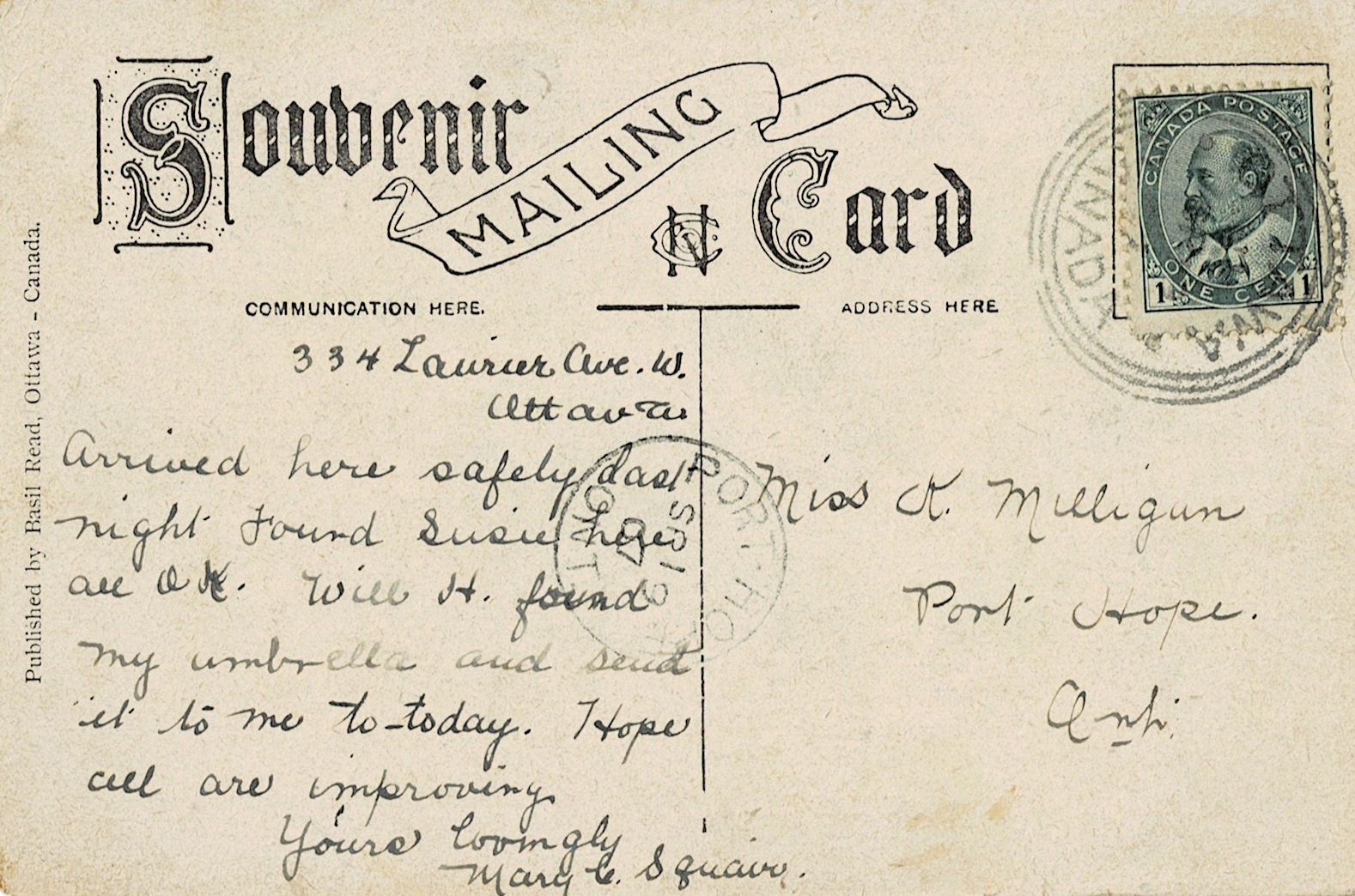
Standard Life Centre now stands at 334 Laurier Ave W., Ottawa.
Arrived here safely last night. Found Susie here, am OK. Will H Found my umbrella and send it to me today. Hope all are improving.
Yours lovingly,
Mary

28 Cedar St. in Belleville, Ontario still stands, and it’s still a family home. The front of this postcard was a real photo postcard, and the list on the back describes the ages of some of the people photographed. This piece is approximately circa 1925.

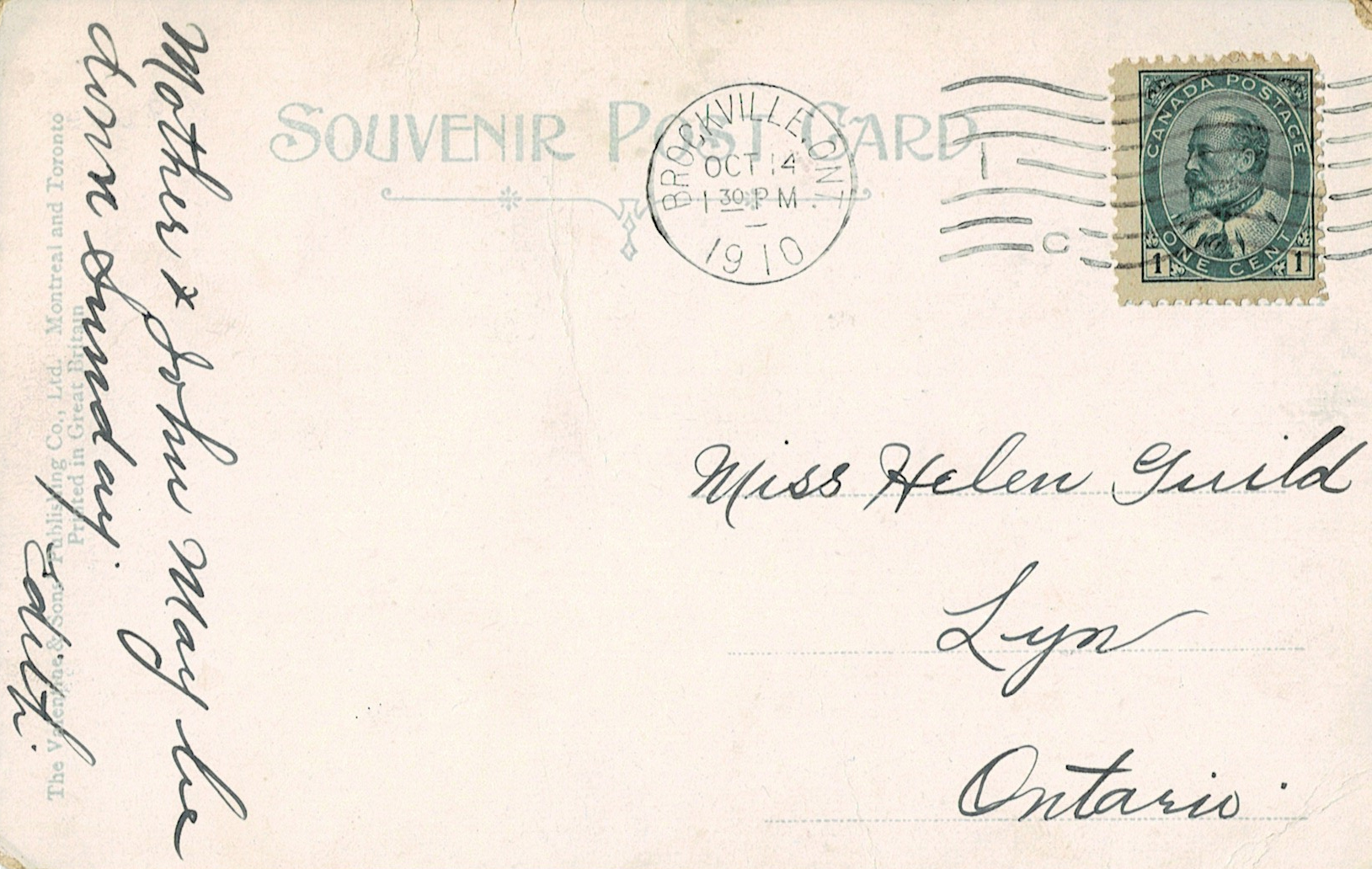
Edith must have been in a hurry when she wrote and sent this in 1911.
Will be down Sunday if it is a nice day.
Edith

A birthday message! That’s about all that I can understand, it’s wishing someone a happy birthday. I can’t even tell who wrote the damn thing.

Well Bertha this card was got in Toronto last year. Well Bertha what did you play on Friday? Well Bertha this is terrible scribbling but I am in a hurry. Well Bertha when are you coming down to our place. I think Pearl and Bella are going to Bertha D[?] next Thursday if nothing happens.
Well I guess I will have to close. Hoping to hear from you soon.
1910
Edith was once again in a hurry, only writing, “Mother & John may be down Sunday.” This was in 1910.

I hope to one day find a postcard from this company that is unmailed so I can scan in that glorious header. There is so much detail and it’s beautiful.
This note expresses that they wish the recipient had stayed longer when they last visited, I think. They also mention having been to the fair and having a good time. This postcard was mailed in 1908.

I do not think this postcard is written in English. I love the hooks on the Xs and the overall writing style, though, it’s very pretty.

Sometimes I stumble on postcards that don’t have anything written on them except for where they’re supposed to go, so all I can figure is that they were sent out to share an image in much the same way we send memes to one another now.
Do you have a favourite cursive writing style? Which of these postcards stood out to you?
If you aren’t sure how to use them, then I suggest using them in adjustment layers to build backgrounds for your project. You can layer other pieces on top of them to create your own cards to paste into journals, or take bits and pieces to include in a collage. As always, I encourage you to play with what you find and have fun.
-
Girl With a Bouquet RPPC Image
I love this image so much.
This real photo postcard shows a little girl holding a small bouquet of flowers. There are some elements that look like they’ve been painted—like the backdrop, and the stems of the bouquet. She has the appearance of stepping out of a foggy moor or something.
Really haunting.
I think that’s part of why I like this vintage image: there’s something odd about it, but it doesn’t seem that way at first. It isn’t until you start really examining the picture that it gets a bit strange.
That, or I’m the one that’s weird. Always a possibility. 😉

I have yet to stumble upon any other images in this series, but if you have, I would love to see them.
What do you think?
-
A Brief History of the Transfer Decal
Once upon a time, people in North America—though probably more in the USA than here in The Great Snowy North—were wild about decals. Water-transfer travel decals could be found on your buddy’s Winnebago or Aunt Velma’s station wagon showing off all the places they’ve been. Maybe Uncle Bernie had something a little risque on his boat.
They were brightly-coloured, a pain in the ass to install, and treated in much the same way as postcards and modern stickers: as a memento of places seen and things enjoyed. Decals like this were affordable, too. You could find them in a variety of stores, or you could order them from catalogues to decorate your kitchen with a hellish amalgamation of fruit and pin-up girls, if you so desired.

Water transfer decals, also known as water slide decals, are descended from Henry Lowenberg’s method of decalcomania: a design printed on transparent paper with gum on the printed side. Once the paper was put on an envelope, for example, it would be impossible to remove without leaving the printed design behind. His invention was meant to stop people from using postage stamps more than once. The cheap bastard.
Not that it was ever used for that purpose or anything relating to mail.
Instead, decalcomania became the decals we know and love. Mostly.
This method was not without its problems, as I hinted earlier: decals during the peak of decal-mania were prone to sticking to anything and everything if they managed to get even a little bit wet—even their own wax packaging! They tended to scratch easily unless varnished after installation, and it was common to buy multiples of a desired design just in case.
Impko: King of the Travel Decal
Impko produced a wide range of souvenir items from their New Jersey location—postcards, pennants, bumper stickers, and more. Their decals sold for 10 to 15 cents a piece, and the majority of their products were silk-screened. This method produced simple, brightly coloured designs that were immediately recognizable. Wherever you went, you could find an Impko decal for that location and add it to your collection—or your car.
Information on the company is difficult to come by. They ceased to exist by the 1970s, likely because they were purchased by Trench Manufacturing Co., a big pennant company at the time. Trench was interested in the way Impko made their pennants and bought the company so they could use their patented process.
You can still find vintage stock of Impko’s line on the internet, through sites such as Etsy and eBay, as well as on various blogs. If you’d like, you can learn more about Trench Manufacturing Co. from K.R. Biebesheimer’s blog, Pennant Fever.

Duro Decal Co., Inc: The Survivor
Oh, there were so many companies that produced decals—but Duro Decal Co. is the only one left standing. Now known as Duro Art Supply, they are best known as the manufacturer of pressure-sensitive lettering for signs, boats, mailboxes, windows, and other surfaces. They still make those, by the way.
Duro participated in the travel decal trade, though not to the same extent as Impko. They offered a large variety of generally-decorative pieces like fruit, animals, miscellaneous characters, pin-ups…

To be fair, I don’t quite recall if the above decal was a Duro or not. The style is very much like theirs.
When Duro was producing decals they advertised them as being “for every purpose”, something that could be applied on anything, anywhere—from a steamship to a watermelon and everything in-between.
Yeah, I don’t know why they specified putting them on watermelons, either.
These days, you’ll have to settle for buying paintbrushes and other art supplies from them. As with Impko’s stuff, you can still find Duro products on the usual marketplaces.
If you get your hands on one of their catalogues, please show me. I’ll be very jealous but also highly excited for you because that is definitely a neat thing to get your hands on.

Back to the Present
Although the companies that made them are (mostly) gone, the products they made still exist, tucked away in derelict print shops and among antique collections. Enterprising entrepreneurs can purchase decal paper to use to make their own, and it’s even compatible with most inkjet printers. You can find and purchase waterslide decal paper here (affiliate link).
Is it likely that we’ll see an eruption of new transfer decals hitting markets any time soon? Probably not. At least, not to the same degree that we saw them in the 1950s and 1960s.
Do you have any old decals in your collection? Share them here in the comments, tell us all about what you’ve found!

-
A Fresh Batch of 12 Christmas Greetings
One of my first batches of postcards was chock-full of Christmas offerings from 1913-1920. Winter scenes are most common in the Christmas cards that I find, and they tend to run the gamut from “birds are Christmas, right?” to “you’re getting a sprig of greenery and that’s final“.
Stingy bastards.

This Christmas postcard gets really fancy in its lettering and includes a beautiful illustration of a cherubic angel with a dove. The dove looks a little like its head has been stitched on, though, and that’s a tad unsettling. Look! The angel fixed it!

“A Merry Christmas to you,” says this grumpy lady. A Christmas card in blue and green! I have yet to find any others like it, and it’s one of my favourites because it’s so bold.

The robins have century-old glitter on them. I have found that antique glitter is as much of a pain in the ass as the modern version, and I know I’ll be finding sprinkles of it all over the place for the rest of my life. Whoever winds up with the physical copies of my old postcards will also inherit the glitter curse. Whoever invented glitter should be shaken repeatedly and yelled at, but the only way to do that now is through a Ouija board, I guess.

A bored child sits on a bench or chair, waiting for something and holding a length of garland. The dog may have been part of their Christmas gift, I’m not sure. Signed by the artist, RJ Best, this postcard remains one of my favourite Christmas graphics because of its simplicity.

Bluebirds may be a symbol of good luck or fortune and happiness, but they’re also really pretty, especially when frolicking in the snow.

The above image also came with the curse of glitter, though it was not a card—it was just an illustration. Whether it came from a greeting card or was taken from a book, I don’t know. I just remember that it was on its own and decorated with black glitter. Kind of odd, but still a pretty picture.

More bluebirds and a wintery scene on this Christmas tag card.

Why are these snow people so cheerful about being stuck in a stocking? I wish I knew. They are unsettlingly happy about it. All I can think is that someone, somewhere, now has wet socks.

A simple and sweet Merry Christmas card for someone’s wife. This greeting card is from the 1940s-1950s.

My favourite part about this depiction of Bethlehem, the wise men, and the shepherds is their clothing. They are wearing colours—rich, beautiful colours! What a lovely old postcard.

A young shepherd cradles a lamb in this Christmas greeting. A little bit of winter, a little bit of greenery. Cut the shepherd out of their frame and you can put anything you want in there, including yourself for the yearly family Christmas card.

This final card is very sweet with its subject matter and how it looks like it was done in coloured pencils. Someone was treated quite well with their Christmas presents!
Do you have a favourite in this batch? Tell me about it in the comments.
If you haven’t subscribed to my mailing list… you’re missing out! It’s a weekly digest so you never have to play catch-up with my blog. Just submit your e-mail to the form in the sidebar.
-
6 Beautiful Christmas Scenes
Week two, and it’s time to go into some of the lovely winter scenes that you can find in antique greetings. From peaceful snow-covered cottages to beautiful old churches standing against winter’s chill, these scenes offer a pretty little taste of Christmas without relying on being cartoony or over-the-top.

Now here’s a pretty sight: a snowy churchyard beneath an overcast sky that’s preparing to dump more snow on the countryside. That yellow church and red house stand out quite well against the sea of white that surrounds them. This image, like most of the greetings on this page, is from the early 20th century—you’ll find I have a lot of imagery from about 1900-1920, for some odd reason.

A distant snowy church, a quiet road, and hopes for a gay Christmas. Excellent. I love it. I’m very fond of that holly frame and the placement of the winter scene. I imagine it would be quite the hike to get through all that snow to attend the church, though. We don’t get snowfall quite like that in my area anymore! You know, the sort where you could step off the roof of your house onto the snowbank after shoveling it off.
Oh, please use those holly berries for a cute little border.

I love this card. It feels like a watercolour painting, and the cottage looks warm and cozy with its glowing windows. I would love to be sitting inside by a roaring fire, sipping coffee while the snow comes down outside. It’s such a pretty little card and a perfect Christmas greeting.

Birds! A snow-covered cottage! A lazy little river. Oh, and the sun coming up over the horizon—or so I gather from looking at it, anyway. The birds are gloriously round and I can almost hear them singing. I’m a sucker for cards that have birds on them, though, and this one is no exception.

I love this Dutch card not just because of the winter scene, with its sleepy village and church beneath the full moon, but because of the combination of that with roses and the little (unexpected) clovers. The clovers and holly sprigs look a bit like they were added by hand by the person that sent the card, don’t they? I can’t say for sure.

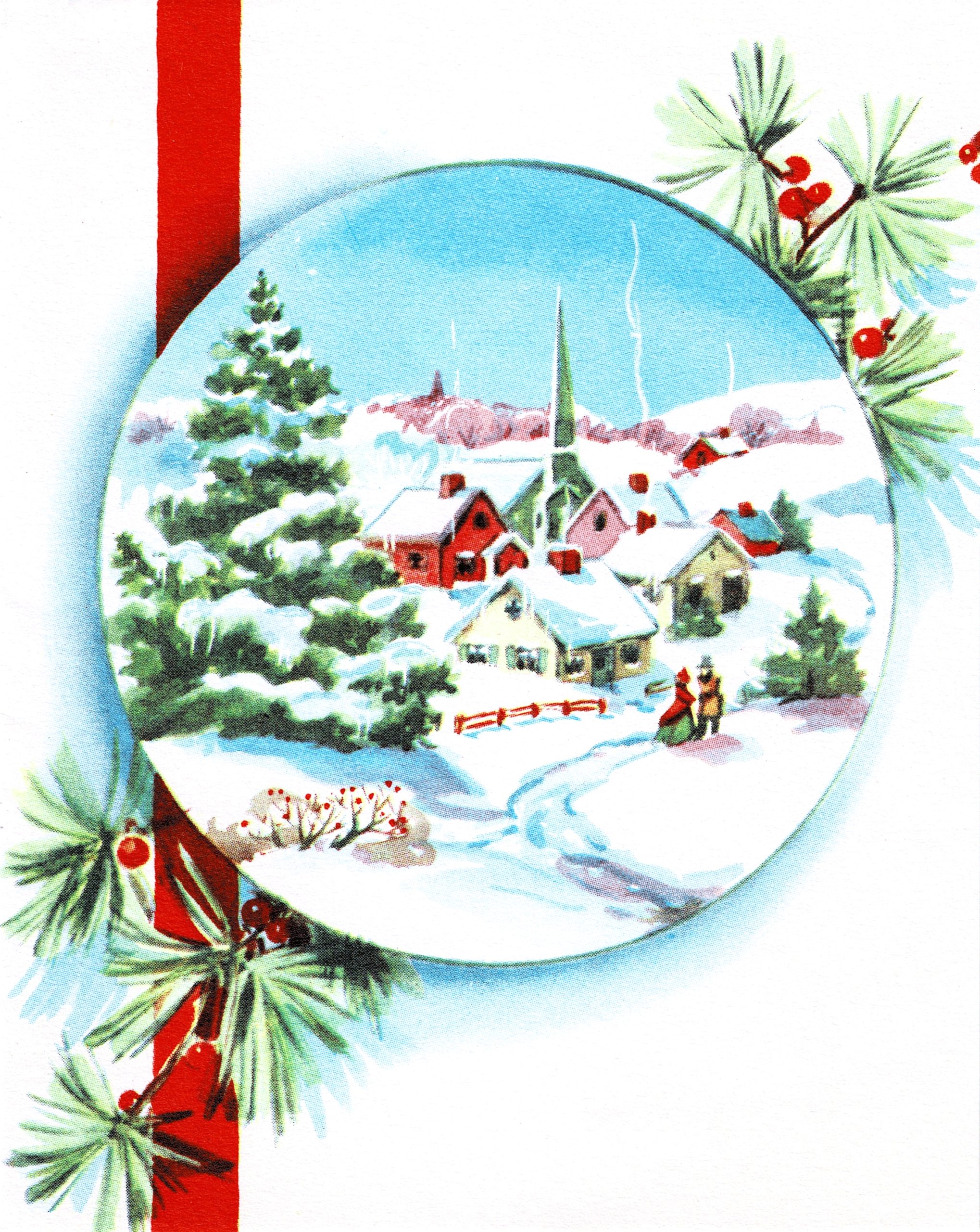
The final vintage image in this series is a beautiful, colourful snowy village. Smoke lazily rises from the chimneys and a couple walks along the town path, enjoying the crisp winter air. This one makes me think of a watercolour painting, too, and it’s entirely possible that that’s what it is. So pretty! I think this one belongs in a frame.
What’s your favourite Christmas scene?
Hey, have you subscribed to my mailing list, yet? Use the form in the website sidebar to do so and make sure that you never miss out on a blog post, ever. I send out a weekly digest through ConvertKit that helps you stay caught up, without spamming you on weeks where I’m especially busy posting. 😉
-
6 Christmas Clip Art Images
It’s that time of the year! Time for holly leaves, Saint Nick, FIRE, and lots of rum balls.
Yeah. Look. I know what I like, and rum balls are the best thing. I was making them without measuring the rum when I was a teenager, most flammable Christmas dessert ever.
Anyway, I’ve gathered together a bunch of neat little Christmas-themed elements for your craft projects this week. Some of the images will be very tiny because they came from gift tags, others are from antique postcards. There will be Christmas items posted every week this month! Yay!
Partially because I have so much Christmas stock, y’all. I didn’t look for it, it came to me. The stuff I’m going to show you this month doesn’t even put a dent in my Yuletide image list. I’m going to have more than enough to do another full month of Christmas next year—and maybe the year after that. Even when I go looking for stuff for different holidays I still find Christmas.

Eat yer heart out, Charles Dickens. The card that the above kidlet came from was so horribly, horribly water-stained that I couldn’t preserve the whole thing. It was bad, y’all, and I wasn’t even sure I’d be able to pull this part off—but it turned out beautifully! Just look at this kid. Adorable! Is it the way-too-rosy cheeks? The fashionable bob haircut? Not sure. But I had to preserve this image, so I did. Pair them with some carolers for a little more “uuuugh not more plastered uninvited guests” energy.

I think you’ll be getting the gift tag that these came from in another post. They’re cheerful and happy in a mildly off-putting way, but I still think they’d make fun stickers. These two are totally polite to you to your face but the moment you’re out of earshot they’re shit-talking you like nothing else.

The absolute best part about this graphic is that you can rearrange the statement however you like, and there’s also enough room to just drop the paper/scroll effect so you can a very pleasant Merry Christmas message on its own. Text in antique postcards is an art form and this graphic is an effective demonstration.

A neat little decorative arch. This graphic was from an antique postcard, and decorated the very top. Remove the holly leaves and berries to make for a simpler decorative element.

Wreaths are classic! This one even has a dangly ribbon bit, and it’s not overly complex. It’s so cute.

A great big sprig of holly from a very large Christmas postcard. Such vibrant colours on a huge image that would be excellent as part of holiday stationery or even a border. Few things scream “Christmas” quite as loudly as sprigs of holly, right?
What Christmas images are you hoping to see? Do you have a favourite “theme” from holiday graphics? Leave your comments below.
Did you know that you can earn 15% off a purchase from my online store just by subscribing to my mailing list? All you have to do is submit your e-mail address here. Confirm your subscription, get your code, and use it at check-out.

The Paper Girl
Antique & Vintage Ephemera Since 2019